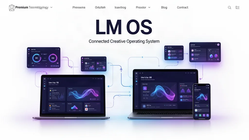
LMOS Beta Update: A More Visual Homepage and a Home Screen That Adapts to You
The LMOS homepage now shows truthful 16:9 creative capability cards, while signed-in members can choose Apps, Projects, Tasks or Creator views and save their favorite app layout without changing or deleting project data.
What changed
Added a 16:9 swipeable, arrow-controlled and keyboard-accessible capability carousel to the public homepage.
Each card represents a real LMOS workflow or a clearly labeled testing state instead of inventing finished functionality.
Standardized the LM app-icon visual system so products are easier to recognize across the operating system.
Added Apps, Projects, Tasks and Creator home-screen modes for signed-in members.
Added saved favorites, app ordering and app hiding. Hiding an app changes presentation only; it does not remove projects or data.
Why this matters
LMOS is becoming an operating system rather than a wall of unrelated software. The homepage should show what people can make, and the signed-in workspace should increasingly adapt to the creator instead of forcing every person into the same dashboard.
What testers should try
Swipe through the homepage showcase on a phone and use the arrow buttons or keyboard arrows on desktop.
Switch between all four LMOS Home views.
Favorite several apps, change their order, refresh and confirm the layout remains yours.
Hide an app and confirm its existing projects remain untouched and accessible elsewhere.
Tell us which home view should become smarter next.
Use the beta on real work.
The most useful feedback is not “I like it.” Tell us where you hesitated, what took too many clicks, what did not save the way you expected, and what would make this useful enough to return to next week.